Putting Data Clean-Up on the Map

Role
Product Design,
UI Design,
UX Research
Duration
Fall - Winter 2024
(3 months)
Deliverables
Feature Requirements, User Flows, User Tested Prototypes, Dev Handoff
Tools
Sketch, Invision, Miro, AG Grid
NOTE: Some details and designs have been removed or changed to protect client confidentiality and proprietary data, but the case study still reflects my process and approach.

My Process for this Project (A Snapshot):

Where are We and How Did We Get Here?
This feature was part of a larger, brand new application that was based off of a manual process that typically took over a year to complete. The decision was made to automate as much data as possible in order to speed up a lot of this manual process.
The step that would include this feature took users about 9 weeks to complete, and the team wanted to get that down to 4-5 weeks. That is where the UX concerns started.
55%
Estimated Reduction of Time on Task
$38,500
Estimated Labor Cost Savings Annually
Data automation can give applications a leg up, especially when the focus is on analyzing it’s outcomes. The trouble is when the data isn’t always trustworthy or clean.
Previously, users had become accustomed to manually cross referencing 4 different databases to clean up the data and get it into shape. They had control over the final outcomes without having any need to audit the final results.
Automation made cross referencing the data easier, but took a lot of that control out of the users’ hands. It was up to UX to find a way to highlight unfixed errors and make sure that users could adjust data when the system got it wrong.
Where the Business Wants to Go
As part of a larger enterprise application, the reasons behind kicking off a project like this were varied and also a bit inconclusive. Our business partners were getting direction from their high ups to fix a very complicated manual process, but didn’t exactly know what to do or how to do it. This is where I was able to support them by defining the following information.
What Isn’t Working:
The team member turnover rate was very high (most left before completing a single cycle)
The process was taking too long and systems were working with out of date information
There was no standard operating procedure which created confused and frustrated users
A completely manual process meant a very high chance of user errors with no way to check or review
No clear understanding of the quality of the data or how much it needed to be manipulated

Knowing what the business needed for this project to be considered a success, I would be able to cross reference that with user pain points in order to prioritize the most important features in the new application. It also meant I could start digging for the current metrics that we could later use to make sure we were headed in the right direction. Having a better understanding of expectations and end goals meant the team was ready to get the project started,
Discovering the Problem
I first noticed the potential issue during the Discovery Phase of the project. A GEMBA walkthrough revealed how much users relied on the ability to edit data at will throughout the entire process. Add on top that users were having to check every cell of data and that lead to a lot of double work, human error, and a lack of an audit capability.
NOTE: This is one of those pesky proprietary information sections.


I brought my concerns up to the rest of the team and we realized that we would need a way to give some control back to the users to correct the data errors, but also balance that with the new abilities that will come with automation. But how?

How Might We…
…give users the information they need to make data changes confidently?
…reduce the risk of human errors while still maintaining user control?
…clearly and quickly allow users to identify potential errors?
Users in the Driver’s Seat
The previous observations and HMW questions were based on interviews that I had conducted with our users.

Total Users
6
Users have completed this step
3
Users have completed the entire process
2
Users has completed the process more than once
1
Excel Experts…
Who are hesitant to need to learn a new application and process
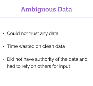
Data Distrust…
If they didn’t check it, they don’t trust it.
~$300 Million…
Operating Margin affected by users annually
2 Types of Interviews
I worked through 2 different types of interviews with my users. The goal for me was to better understand their process and to get them to trust me as their advocate as we built this application for them. I did a second round of interviews with the 3 users who had competed this stage in the process to get more in depth on what they were use to and what improvements could be made.
Group Interviews

The focus was on connecting with the entire user base and getting them comfortable working with me.
We walked through an overview of the entire process, which already started to show where the cracks in their training were.
We talked about general pain points felt throughout the process and in every stage of competency that the users and experienced.
They shared work arounds and solutions they had to create to solve existing problems, which gave me insight into features needed and potential pitfalls that might occur in development.
1-on-1 Interviews

These interviews were conducted with the 3 team members that completed the error correction step in the manual process
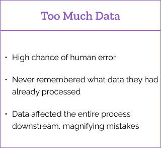
Millions of rows of data meant that the data correction process was extremely tedious and time consuming, clocking in at over 9 weeks of manual labor. Going cell by cell was necessary as they never knew what the outcome might be.
Often they would have to reach out to other teams for clarification or advice.
They would spend a great amount of time looking at data that was already clean and ready to use, which equated to the feeling of a lot of time wasted.
With so many cells of data, the likelihood of mistakes was high, often leading to later rework.
It was difficult to remember where they left off at the end of a working session.
They had to rely on learned knowledge to determine if the changes they made were correct, the trouble was that most users hadn’t been on the team long enough to gain that used knowledge and it changed depending on which engine line a person was working on.

Interview Highlights

Ideation Pitstop
My next step was just some rough ideation on possible solutions.
I looked at how other products and services tackled some of these user issues, starting with products in the company already to try and maintain consistency across features. I also researched 3rd party possibilities as well.
NOTE: This is another one of those pesky proprietary information sections.

I made lists of possible solutions and how I presumed the flows and screens would adapt to those solutions. Then, it was collaboration time!
Development Reads the Map
I connected with the dev lead to discuss possible solutions.
He had much better knowledge of the data sources available and how they were being used in other applications across the company. From there we worked out the biggest concern - individually cleaning every cell of data.
Auto-Mation Nation (Building Back End Logic)

Using the same sources used in the manual process, we could do most of the cross-referencing for the users. Weeding out any data that matched on the back end as clean data and only needing user time on data that needed more attention.
I recommended that data should only be marked as clean if the system could guarantee through multiple (at least 3) data points that the data was correct. This would remove the bulk of the data clean up from users while still letting them feel in control over the messy parts.
Because we now had those sources of data available, we could use them to make qualify the systems decisions to the users and give them recommendations on how to fix bad data!
Once that major time saver was planned out, it was time to see what the interface could do to make their lives easier.
Finding Direction(s)
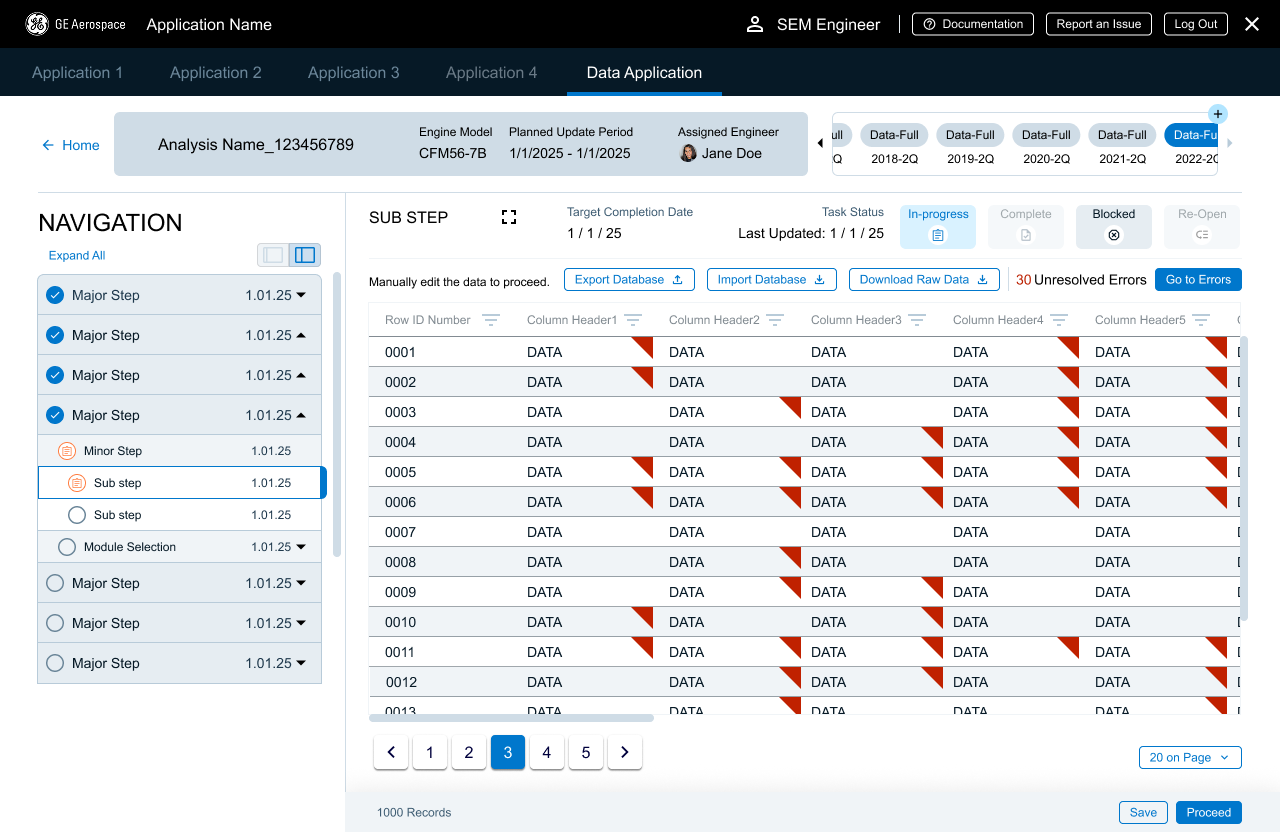
Through the research, users made it clear they needed to have access to all the data, to see it and edit it. But with about 500,000 cells of data, weeding through what was good data and bad data would take forever (or about 6-9 weeks).
500,000
Estimated Data Cells (Or is it…?)
2,160 Hours
Estimated time spent on this step annually

With the logic in place and the idea approved by my dev team - it was time to design!
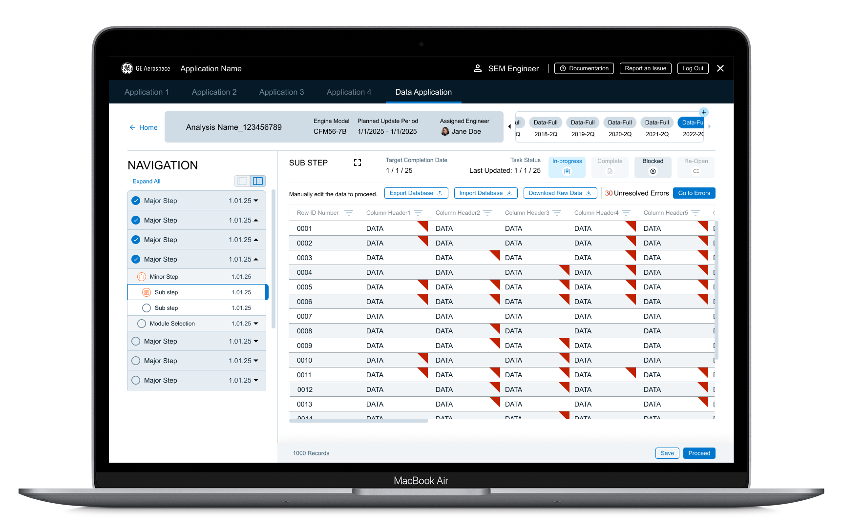
Imagine this, instead of a map, it is a database. Instead of locations, the users are guided toward data errors. In addition, users could jump from error to error without having to search. They could be guided without being constrained!
The first thing I needed to do was make sure users could find the data.
I put on my research hat and started looking at other database designs, but none of it was supporting the vast amount of data used in this process, nor was it really helping to guide the user. So, I started looking at other industries and design patterns - enter google maps!


Map = Database
Location Markers = Bad Data
Flagging Down the Dirty Data
For the layout and creation of the database, I worked with the subject matter expert to make sure that data was laid out in a familiar pattern. Users were already overwhelmed at the idea of using a new application, so I didn’t want to change data patterns unless absolutely necessary.
Building from there the next step was to find a way to indicate a cell had questionable data. There were a few considerations:


I tried several common, established patterns, but they fell short of the considerations.
Cell Highlights? Nope.
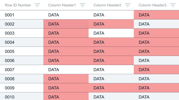
Conflicted with other states - including the heat mapping used future steps and the edit state
All the red blocks overwhelmed users and removed the benefits of the striped rows in the design system
Cell Borders? Nope.
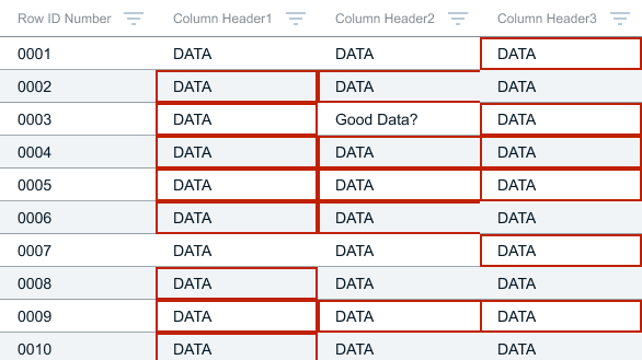
Obstructed the Data - it was difficult for users to see good data cells that were surrounded by bad data cells
Conflicted with other states - Primarily the edit state that was part of our larger design system
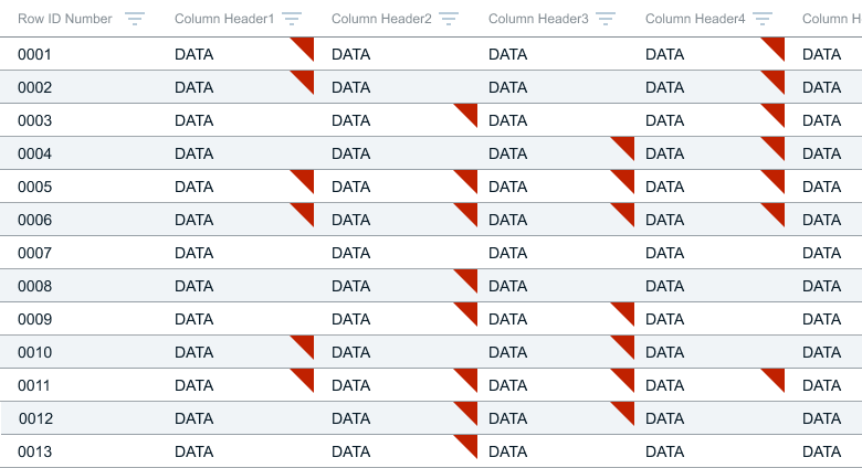
Using the analogy of data as a location on a map it became easier to decide - we needed a flag.
Navigating the Data Highway
Moving from one error to the next manually could lead to missed cells and that’s bad, so the system had to track interaction. I also didn’t want users to get bogged down by going back over the data that the system had already designated as correct - they needed to focus on the things they should change and needed to change. It also needed to be unobtrusive if users were just using the data as reference and were not intending to manipulate it.
Next was supporting how the users were going tomove from one data error to the next.
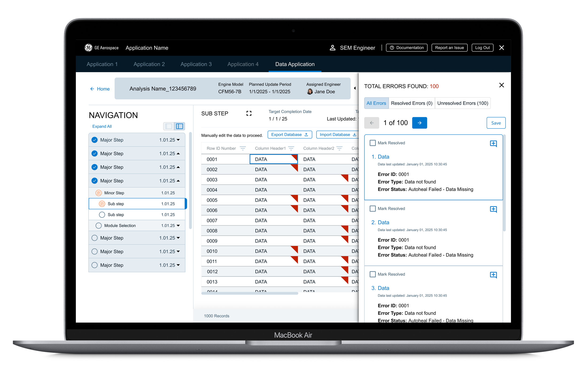
Enter the side panel!
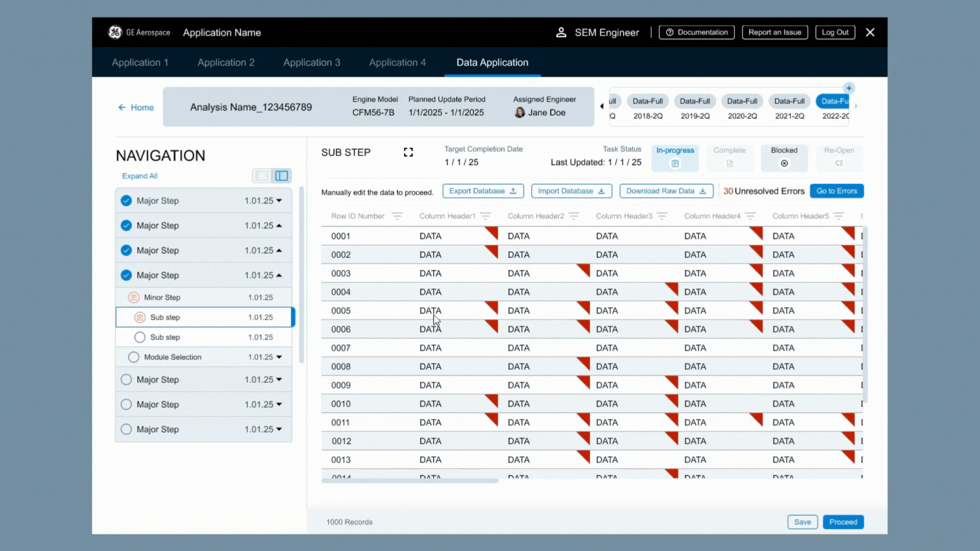
Users had a complete list of corrections needed that could be used to jump from one error to the next. Using the previously created backend logic, this meant they spent less time on double checking clean data and could focus on the data that really needed their help.
Are We There Yet?
It was important to me to bring users back into the loop when it came to the details they needed for their analysis and data correction. There was no SOP or guidelines available, so the users had been relying on learned knowledge that was passed from one team member to another during their onboarding. While the user base was small, it was mighty.
Through the feedback process, we were able to refine the information displayed from the backend database to what would be most beneficial for users. I created rapid prototypes that allow the participants to better understand how the application would act. They could then make any corrections or suggestions to keep things aligned with their needs and goals.
This turned into more than just a feedback loop - it created the cadence of real time usability testing, saving us hours of work and potential future rework.
Some Changes Made Based on this Feedback Cycle:
The supporting information provided for each piece of data
The need for Error ID number to make it easier to discuss user concerns with each other and outside the team
A clearer date layout for international users


After several rounds of feedback and both user and business sign off - it was time to go high fidelity and dev hand off!
Bumpy Roads Ahead!
Everything seemed to be smooth sailing (not to mix my transportation references). Users were happy. The business was happy. We were ahead of schedule! Everything was going according to plan. Until we were in development, and we discovered one piece of incorrect data that would drive us off the road.
5,000,000 data points
is greater than
500,000 data points
In the initial research with users and business partners, it was estimated that there would be approximately 500,000 data points - maximum. Once we got a hold of the data, it was actually closer to 5,000,000 data points. The page simply couldn’t process that much data.
An infinite scroll would have been a heavy load on the backend architecture and would have taken away some of the user control as to what data they were able to see. We were already looking at exponentially longer loading times, so something had to give,
I made the call to add pagination, but to keep the errors panel available for each page. The screen space lost to the pagination component meant users couldn’t see as much data as before, so I created a full screen view that the users could switch to manually. They would lose some of the lesser navigation and features, but they could see more information at one time. I also concerns about creating potentially unrealistic expectations for error numbers, but working with the developers, we were able to jump not only from error to error, but also from page to page. This meant that we could give users information based on the entire database, rather than just one page’s worth of data.

Lesson Learned:
Verify user statements with actual data whenever possible.
Last Mile of the Journey
Along with the process surrounding this feature, it was time to show off the functionality to the larger team, which included not just the development team, but also our business partners and wider user base.
The rounds of feedback had been well worth it. The users were excited by how much time they would save and business was excited by how much money they would have saved. A few minor changes were needed (including how we could incorporate this into other areas of the process) and implemented before it went into development.
While the process had not been perfectly smooth, once this feature gained sign off, it all green lights ahead.
You’ve Arrived at Your Final Destination
A lot of work went into creating this feature, not just from a UX and design perspective. Without the collaboration and efforts of everyone on the team, the following results would not have been possible. So a big shout out to the business partners, developers, and product team.
The following metrics reflect the the users’ first time experience in the application with this feature. As they become more comfortable with it, the numbers are expected to increase.


Want to learn more about my approach to helping users move from Excel Experts to Application Appreciators?